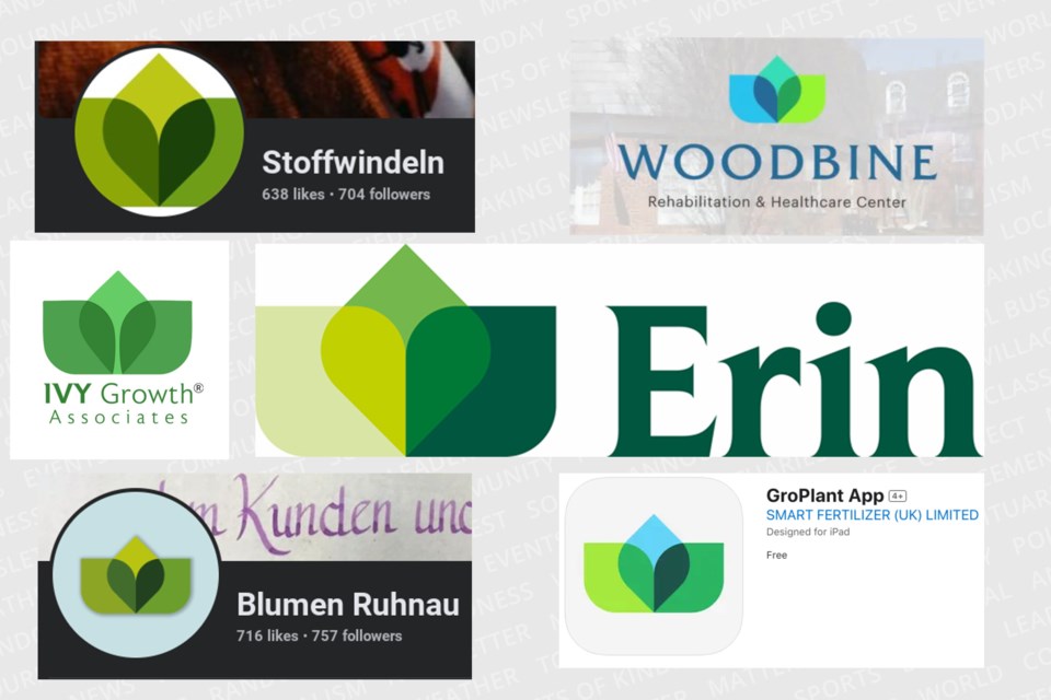
ERIN – Erin’s much maligned attempt at creating a new municipal logo is officially over.
At a meeting Wednesday afternoon, Erin council approved reverting back to the previous logo and directed staff to create a higher-resolution version with the same “look and feel” of the shamrock-based logo.
In September, the town unveiled a “brand refresh” which included a new logo of three leaves creating a heart in the middle, mainly with green colours and “Erin” in a serif font at a cost of $20,000.
This was met with almost immediate backlash from the public who noted examples of similar logos from companies around the world on social media, calling it a waste of money and decrying the lack of public consultation as calls for input on the rebranding were put out just nine days prior to the announcement.

That same day, a petition was created to restore the town’s traditional logo. Later that month council approved a motion by Coun. John Brennan to revisit the rebranding process through assembling variations of the previous logo and consulting with the public.
There was a pause in council chambers when this report was brought forward followed by some chuckles before Brennan broke the silence.
“This is the way we should be going, it not only at this point in time something that’s been deemed acceptable by the public in general it also avoids costs at this time,” Brennan said. “If you go through a rebranding thing and you start doing your trucks, your signs and all the rest of it, there’s a cost incurred in that.”
To be clear on what this meant, CAO Rob Adams explained staff would look at changing any material on the website and emails back to the old logo and slowly work on getting a clearer version of it.
“The image has actually been distorted over time, the shamrock has moved off centre of the ‘i’, the font has bled together, the r and i bleed together,” Adams explained. “I think the first step is, if council approves this, we’ve made the change to use this as our logo and we’ll start using it as our logo. The second phase is to get the cleaner, high resolution one and work that in as we move forward.”
Council unanimously approved the report.
.png;w=960)


